Vespa Primavera: LIBERARE
The Brief
As a student of UNSW Art & Design I was invited to bring to life new interpretations of contemporary culture and lifestyles applied to one of the Piaggio company’s iconic brands - Vespa. Working within the brand guidelines supplied by the client Piaggio Asia Pacific, I was asked to develop design concepts that interpret the Vespa brand story for Australian demographics, maximising brand exposure and improving relevance towards different target audiences.
Deliverables
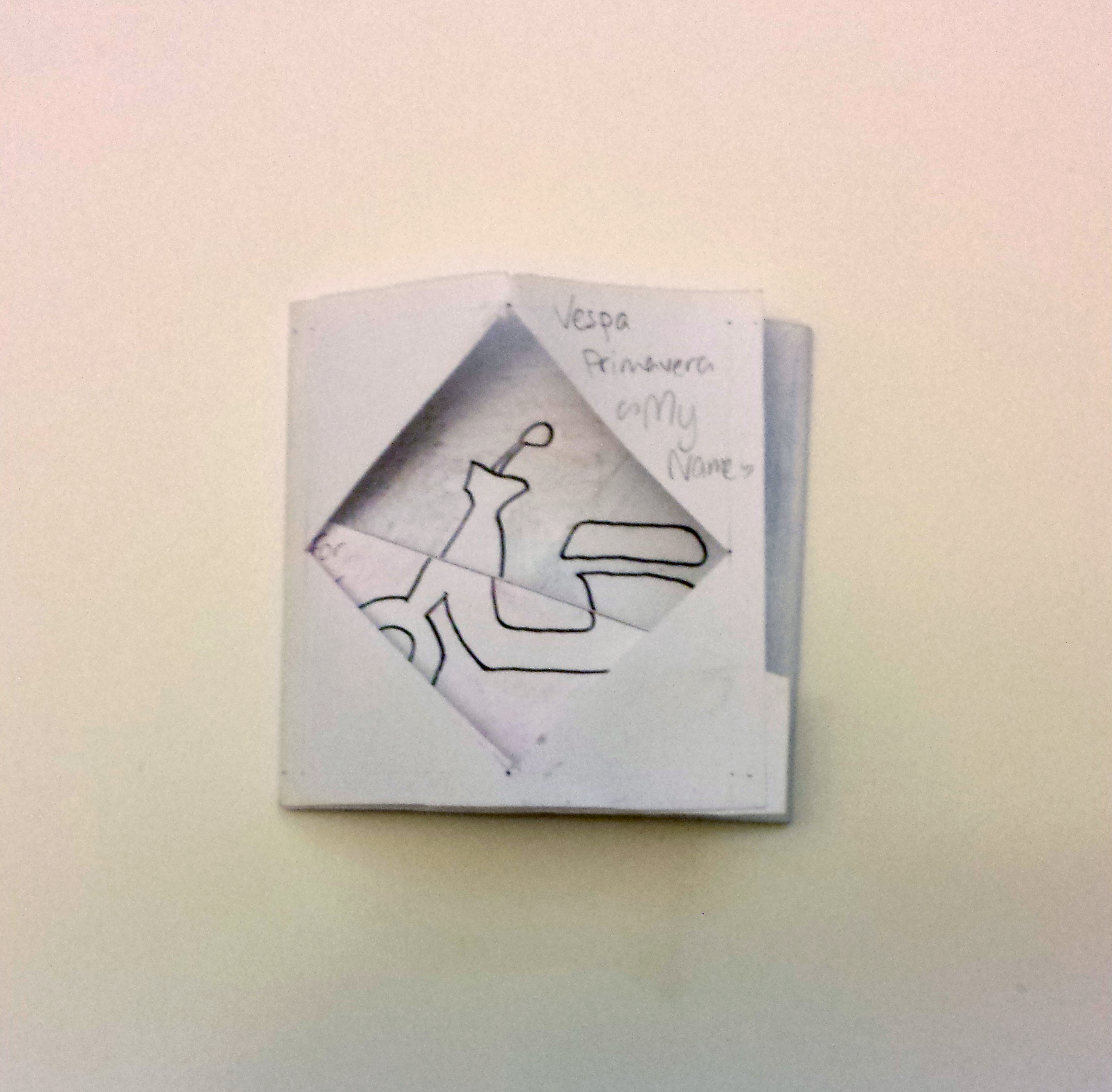
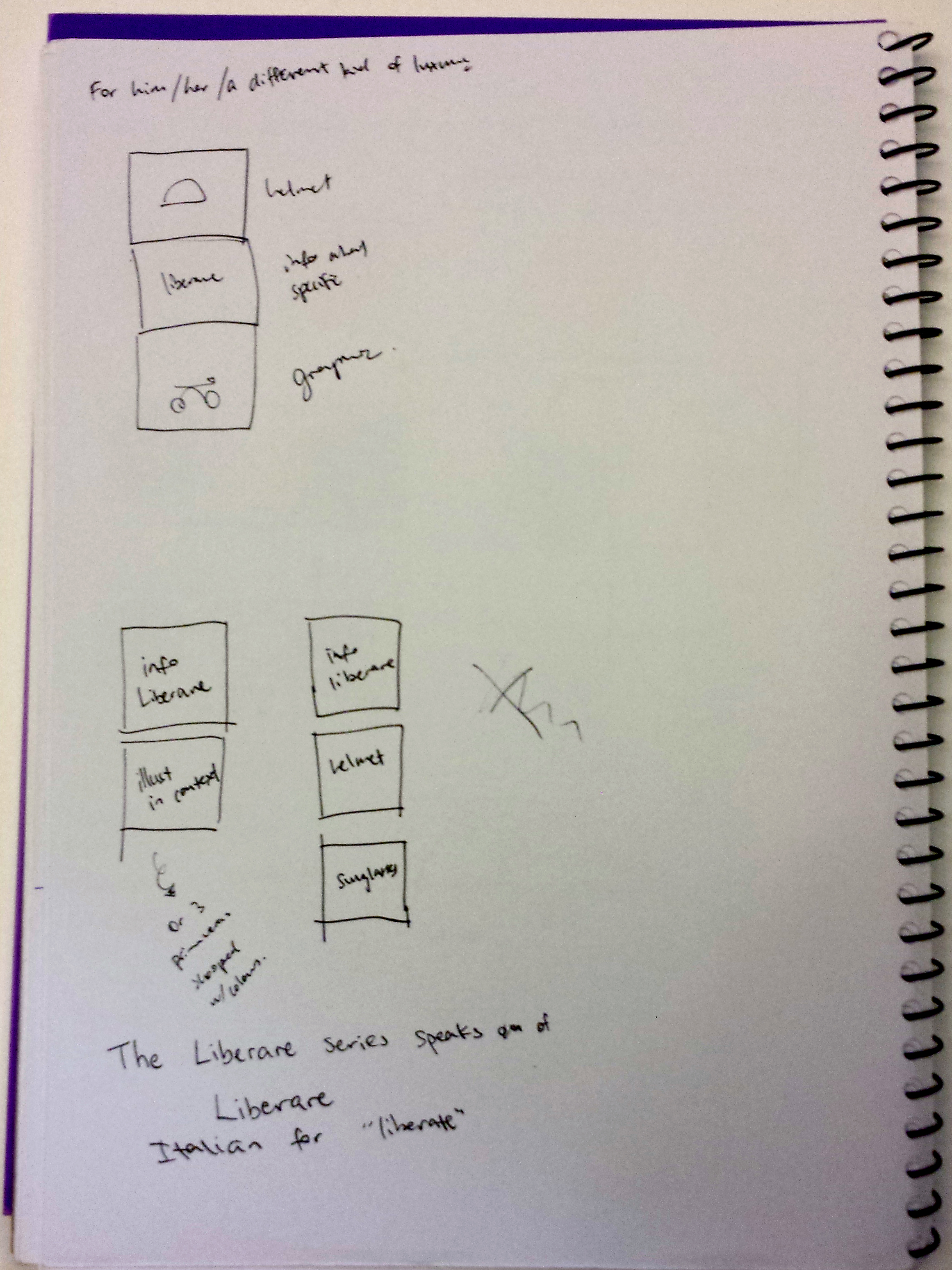
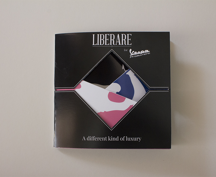
Italian for ‘Liberate’, the underlying idea of the Liberare involves breaking free from the confines of society to experience unbound luxury – going hand-in-hand with Vespa’s identity as “the classy, irreverent side of personal mobility.” The ‘Liberare’ comes with an exclusive helmet and pair of sunglasses, and is available in three contrasting colours – pink “for her”, blue “for him” and black “for those who dare to be different”.
The idea of ‘unbound luxury’ works well as a single unifying concept. In my showroom publication especially, the parallels drawn between the visual design and conceptual design strengthens my overall work, resulting in a persuasive, visually engaging end product. There is definitely a sense of ‘breaking free’ or ‘unleashing’ as the front cover is turned to reveal a bold layered silhouette. As each layer is peeled away, the silhouette grows bolder and stronger.
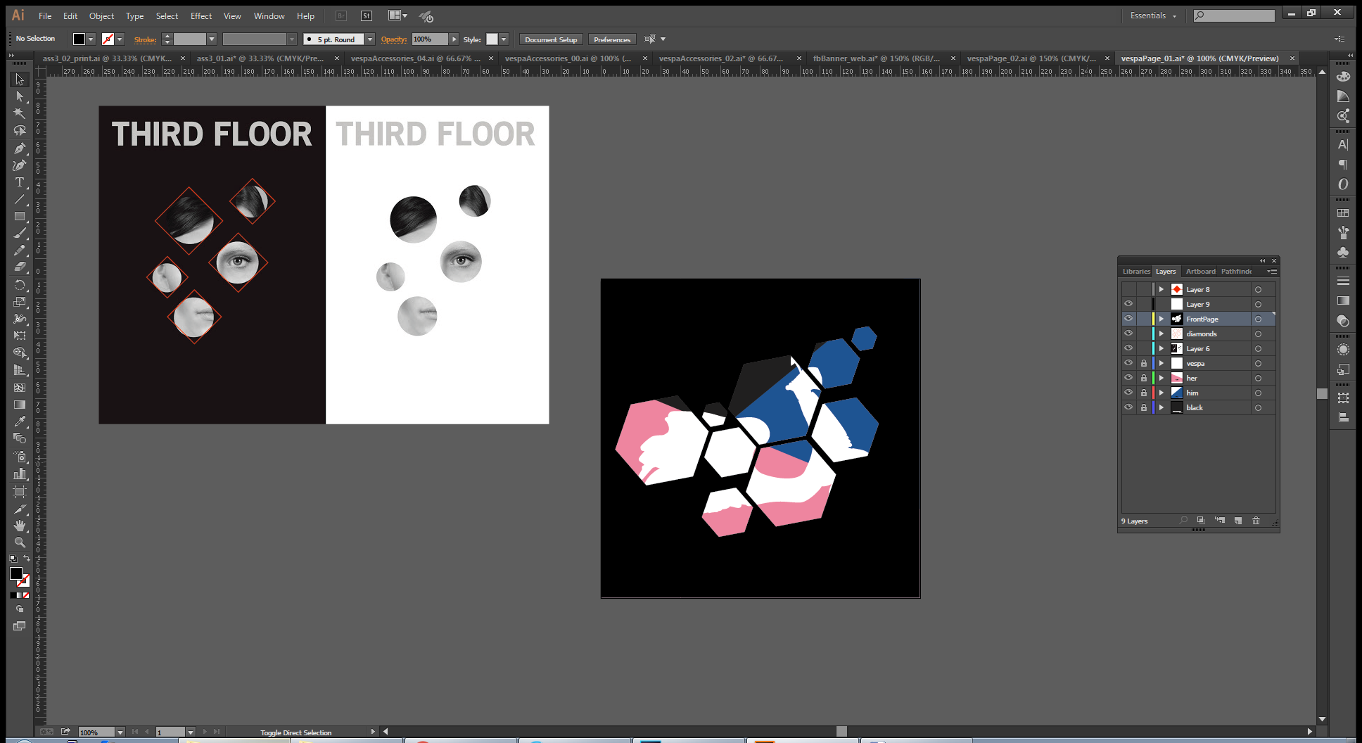
Showroom Publication


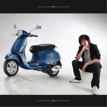

Bus Shelter Advertisement
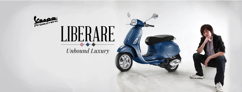
Facebook Cover Photo


The Design Process - Research
I found creating personas to be a valuable way for me to consider the goals, desires and limitations of potential Vespa customers. This helped to guide my decisions regarding the designs I applied to the Vespa Primavera, and the visual design of my showroom publication, Facebook banner and bus shelter advertisement. I was able to create designs targeted towards a specific target audience, rather than a generic “everybody”.
Personas
Persona A:
Arianna – age 28
- Fashion blogger, model, fashion designer, Instafamous
- Hobbies include: eating, clubbing, Snapchat, and eyebrows being “on fleek”
- Uses Vespa to get between home, gym, photo shoots, event appearances, and meetings with clients
- Likes: Pink, hello kitty, edgy kawaii, softserve ice cream
- Dislikes: f*ccbois, h8ers, chipped nails
Persona C:
Zhe Wen – age 25
- Has rich parents, barely employed, “bad boy” but very fashion conscious in the Asian sense of keeping face 爭面子
- Hobbies include: making connections, playing mah-jong, going karaoke, going to Star City
- Uses Vespa to travel between home, mah-jong parties, karaoke parties and inner-city friends’ homes. Also likes to just stand around his Vespa and feel proud about it.
- Likes: expensive things, luxury, expensive cologne, nightlife
- Dislikes: cheap things (unless it’s Asian street food), sport, physical labour, hot weather, staying home
Persona B:
Timothy – Age 32
- Tech startup co-founder, Design/UX team lead, Conference speaker
- Hobbies include: indie video games (Journey, Bastion), non-rigorous outdoor activities, Tweeting about how important technology is for social change
- Uses Vespa to travel between home, work, conferences, and just to cruise around the city and appreciate what life has to offer
- Likes: craft beer, Apple, the Greens, #hashtags
- Dislikes: Windows, Tony Abbot, Malcolm Turnbull, discrimination in the workplace
Moodboards
I created a mood board for each persona to visually establish the aesthetic ‘vibe’ of each, and also created a fourth mood board focusing on typography, line quality, and geometric forms that could branch between all three personas. These mood boards were especially useful in giving my project a clear underlying personality.


THE DESIGN PROCESS - Ideation
Taking into account the information gathered and personas established, many ideas and concepts were formed during the brainstorming process. During this stage I found it helpful to record as many ideas as possible, despite how ridiculous or impractical they may seem, as the goal of this stage is not to cull away "bad" ideas. Instead, this stage is for creativity, and thinking "outside of the box", as sometimes it is the wildest ideas which lead to the most successful solutions.
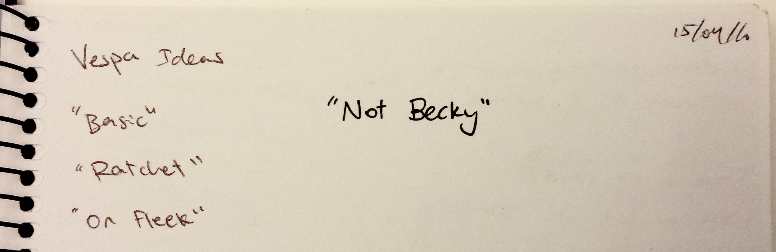


Here, a clear direction began to emerge. My Vespa Primavera design and associated accessories would be available in three exclusive colours – one “for him”, one “for her”, and one for “those who don’t conform to society’s standards”. This nonconformity expanded to the idea of breaking free from society's expectations, as Vespa claim to be "The classy, irreverent side of personal mobility".
Inspired by the Architectural concept of a ‘parti’, I wanted my all my design components to be supported by a single unifying concept. I hoped that the parallels drawn between the visual design and conceptual design of my project would strengthen my overall work, and result in a persuasive, visually engaging end product.
Frederick, M., 2007. 101 things I learned in architecture school. Cambridge: Mit Press.

THE DESIGN PROCESS - Experimentation and Prototyping
The colour themes I explored were inspired heavily by my mood boards and by Pantone’s Colours of the Year for 2016. I decided to play with pale pinks and blues to capture the Zeitgeist, appealing to a young, hip generation of potential Vespa customers.


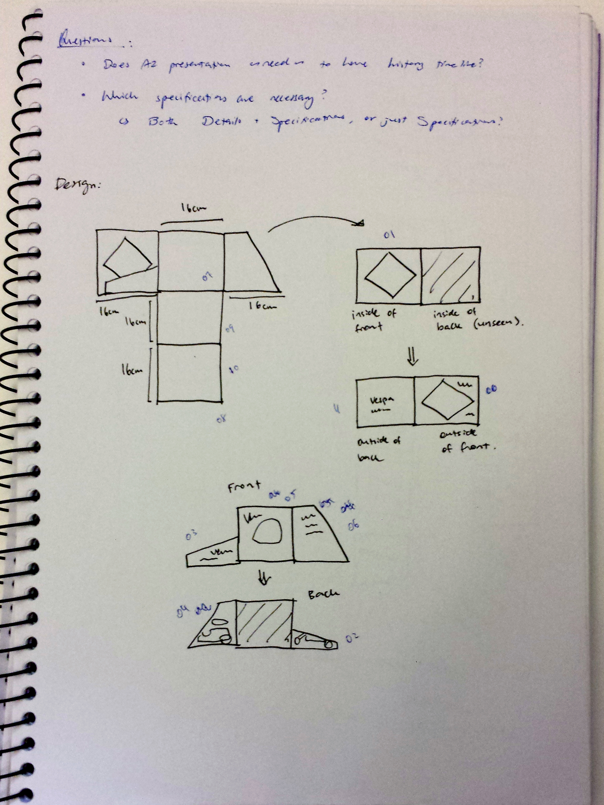
I began to experiment with low-fidelity physical models to help visualise the showroom publication as a three-dimensional object. Here, carefully crafted, highly detailed finished models would not have been useful design tools as the purpose of this exercise was to evaluate ideas under consideration, not document design decisions that have already been made. Here, I managed to overcome issues I have had with previous projects where I have struggled with creating high-fidelity models and wireframes too early in the design process, resulting in me getting attached to certain small details while losing sight of the big picture.


THE DESIGN PROCESS - Iteration
The above physical models were then shared in a studio environment for feedback, changes were made for the next round of models, and this new version would then be shared for further feedback. This cyclic process of prototyping, testing, and refining ensured what did and didn't work was established early on in the design process, leaving me free to focus on pixel-perfection in the latter stages. In previous design projects where an iterative design process was not employed, I often ran into situations towards the end of production where hours of visual design work had to be undone in order to make a functional change. I found this iterative design process incredibly helpful, as I was to identify any issues early, meaning they were less costly to fix.